Company: Association of Small Business Representatives, Ivano-Frankivsk, Ukraine
Project: Visual identity
Expertise: Branding, Identity Design, Graphic Design, Icon Design, Illustration, Type Design
Project: Visual identity
Expertise: Branding, Identity Design, Graphic Design, Icon Design, Illustration, Type Design
Background
Ivano-Frankivsk is a city in western Ukraine. Founded in 1662 as the Polish town of Stanisławów (Ukrainian: Stanyslaviv), it occupied an important position on the northern approach to the Yablonitsky Pass over the Carpathians. From 1772 to 1919 it was held by Austria; in 1945 it was ceded to the Soviet Union and named Stanislav; and in 1962 it was given its present name, honouring the Ukrainian political activist and writer Ivan Franko.
Challenge
Over the last few years Ivano-Frankivsk (Ukraine) has been losing its architectural style due to the growth of outdoor advertising. While the government remained inactive, civil society organizations, especially small business representatives, established a public initiative to solve the problem. They planned to create a brand new city identity and to develop a style guide for regulating outdoor advertisements in Ivano-Frankivsk.
Action
What do the Polish rulers, the Austrian empire, and Soviet authorities have in common?
After weeks of research, I discovered one firm witness: a Ukrainian peasant. Simple, humble and hardworking, he was there to defend the city, or to repair the ruins.
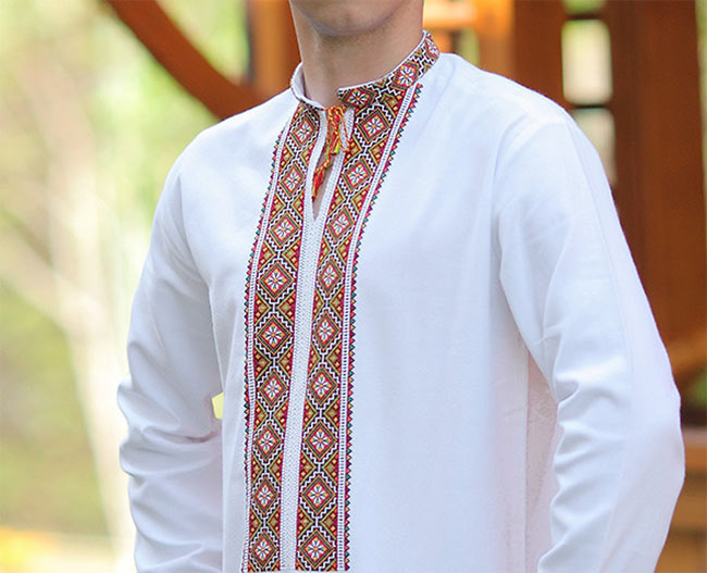
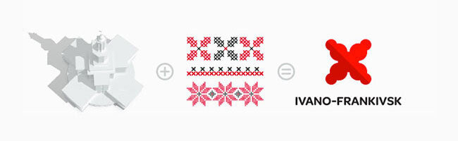
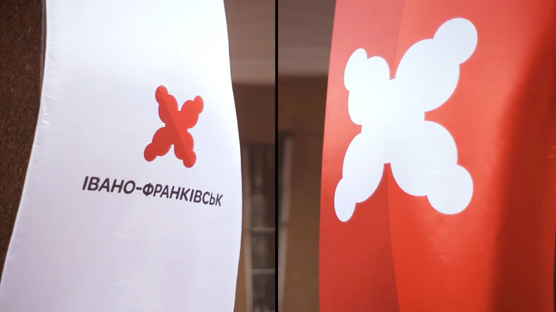
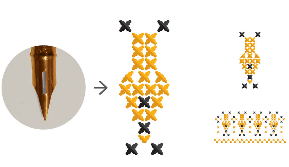
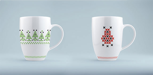
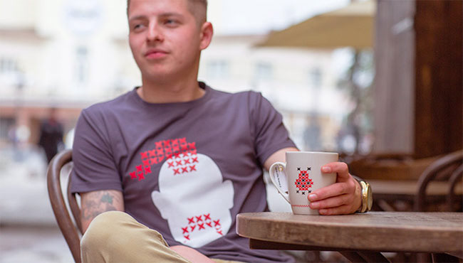
A single embroidery stitch from his traditional shirt became a visually striking and easily adjustable emblem which was combined with the architectural fundamentals of the city hall called Ratusha — the most prominent urban mark, both visually and metaphorically.
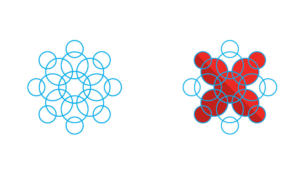
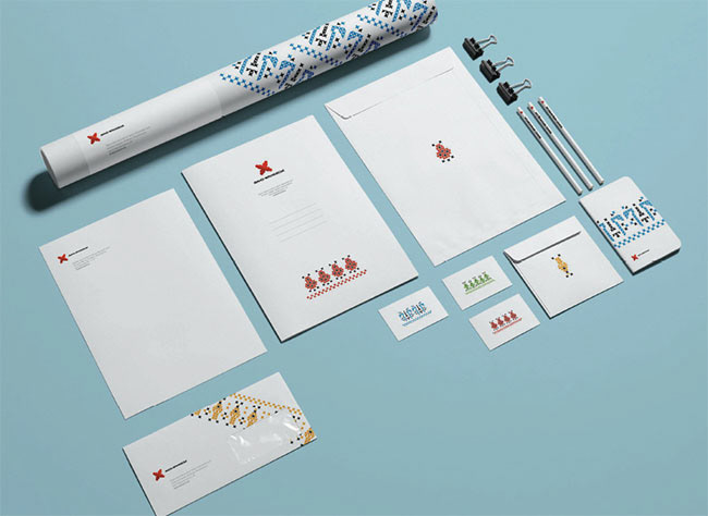
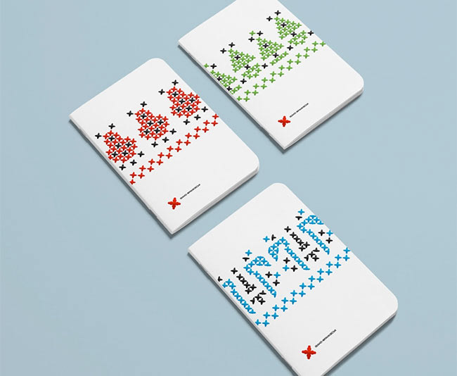
To enrich the visual identity, I created 4 patterns representing: History, Heritage, Art and Literature, and Nature. These four themes emerged among many others as distinctive storytellers. In the form of embroidery, made of the Ratusha stitch, and with clear symbols, they are telling the story of IF.
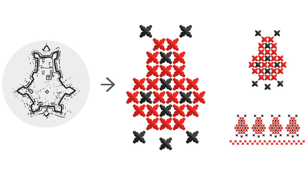
“History” pattern - derived from the Stanisławów Fortress – the original construction that surrounded city.
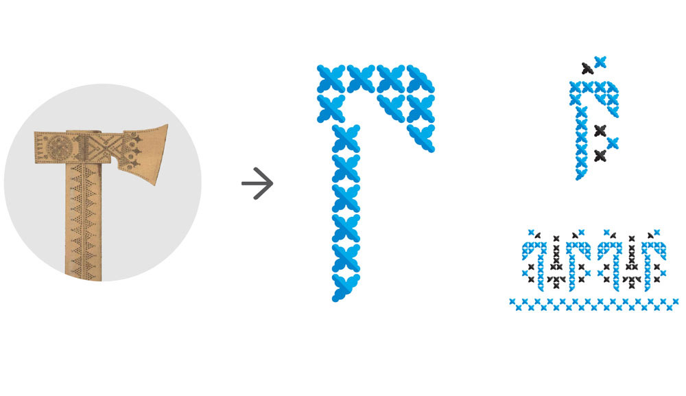
“Heritage” pattern - representing the bartka, a local relic, this pattern shows IF’s bold ethnographic heritage.
“Art and Literature” pattern - refers to contemporary art and literature, prominent in the city.
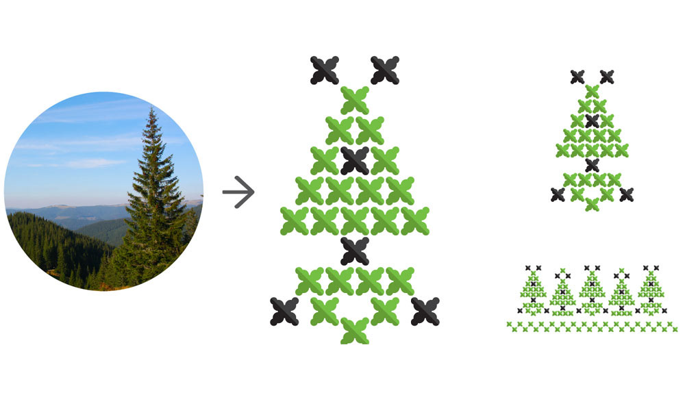
"Nature" pattern stands for Carpathian mountains.
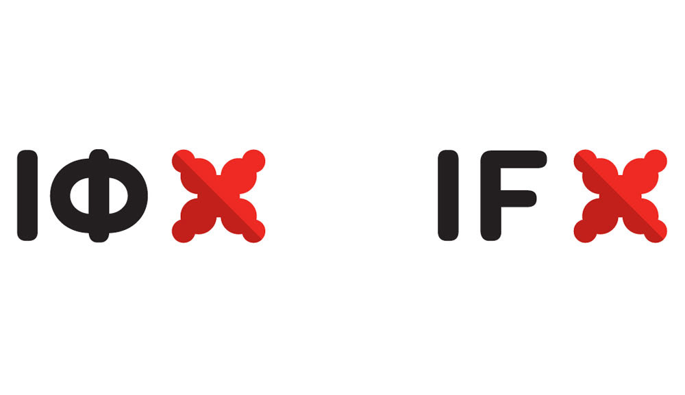
A customized version of Omnes was chosen for the wordmark typeface. It complements the geometric structure of the symbol with its rounded, strong appearance, and unique characteristics.
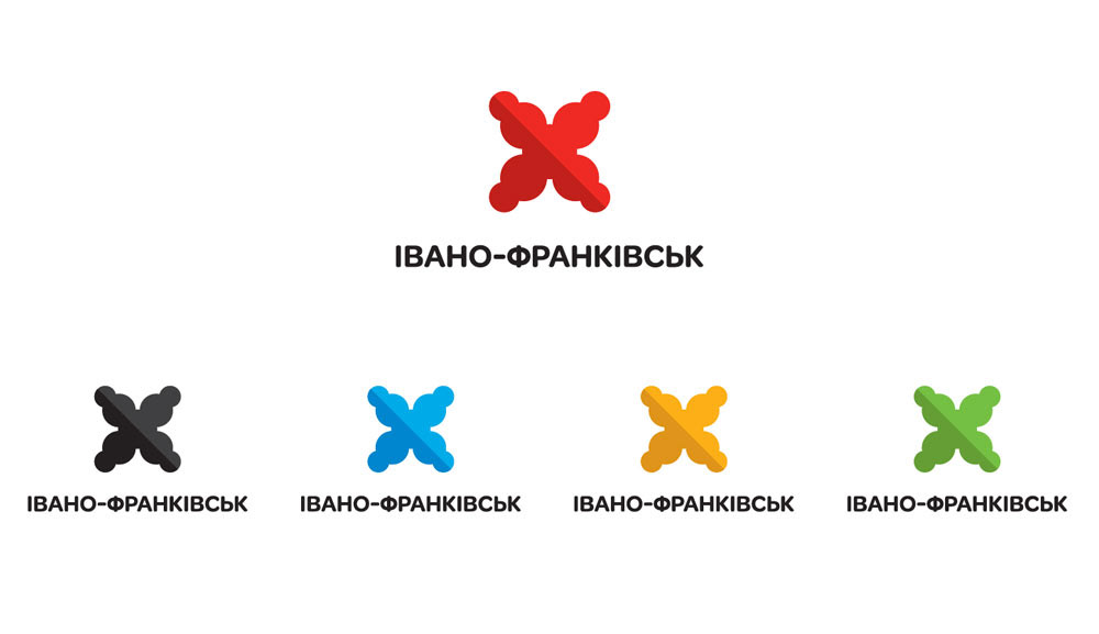
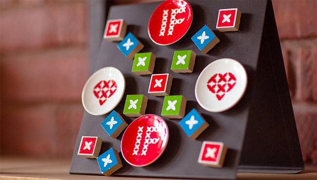
A bold, dynamic colour palette captures IF’s full identity.
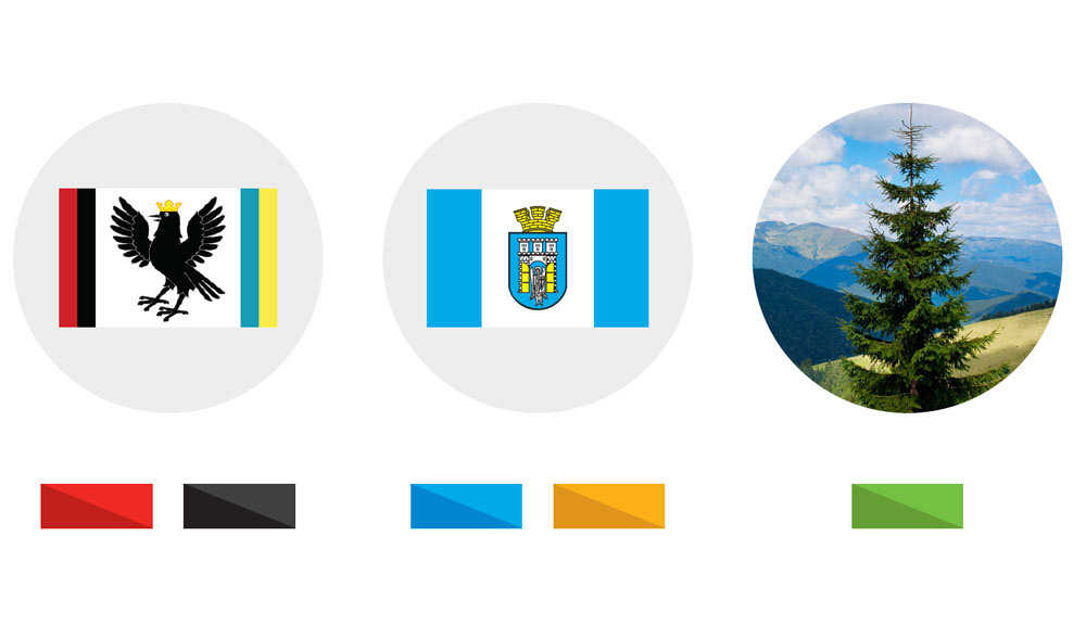
Red and black are the regional colours (regional flag) with deep roots in local folklore. Blue and gold (city flag), a slight adjustment of the colours of the Ukrainian flag. Green, for the city’s most valuable asset - nature.
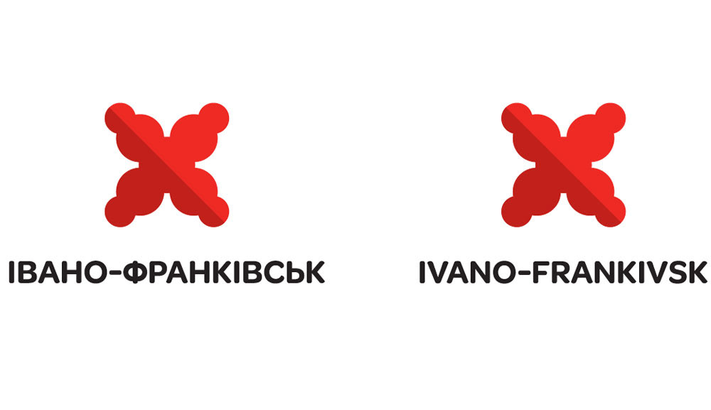
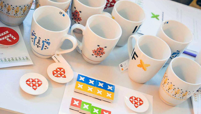
An abbreviated version of the logo creates playful variation of the identity, intended for unconventional uses, for example, stickers.
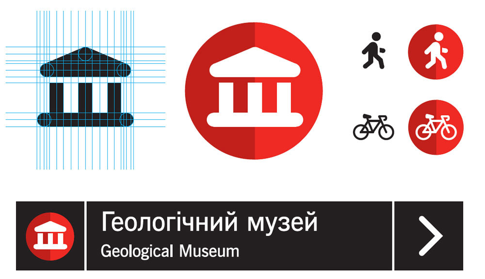
The signage icons were conceived as an additional ‘visual flavour’ of IF’s brand identity.


Impact
The visual identity for the city of Ivano-Frankivsk was recognized at Cannes Lions as one of the top five large scale logo projects in the world for its exceptional creativity (2014 Design Lions Award Finalist).
Credits: Aimbulance

“Jovan has a proactive approach, delves deeply into the project, and delivers excellent results, which are highly creative yet practical.”
— Roman Havrysh, CSO / Partner, Aimbulance