
Company: Vice Media, Brooklyn, New York, United States
Project: Vice Magazine layout design refresh
Expertise: Art Direction, Graphic design, Typography
Project: Vice Magazine layout design refresh
Expertise: Art Direction, Graphic design, Typography

Background
The nice people from Inkubator.ca hired me to help them refresh the layout of Vice Magazine.
After almost 20 years, Vice Magazine's success and worldwide popularity had outgrown its initial idea. The same could be said for its design layout. Metaphorically speaking, a young rebel had become an established adult, and the old clothes didn’t quite fit anymore.
Challenge
The goal of the refresh was to come up with a concept that would visually unify the eclectic content of the magazine, keep Vice's characteristically blunt visual style, and make it accessible to young readers steeped in the new “byte”-sized reality of consuming information.
Action
We quickly realized that the magazine's diverse content needed its proper visual counterpart. As the one of the editors summed it up: “The new layout should be like a Pixies song – with its loud and quiet moments.”
Loud & Quiet concept
Loud moments should wow users with their “fast and furious” content, and quiet ones should give them rest to allow for the deep reading that is needed for longer stories. To achieve that, we decided to focus on two aspects: the conceptual (content vs. form) and the utilitarian (paper vs. screen reading).
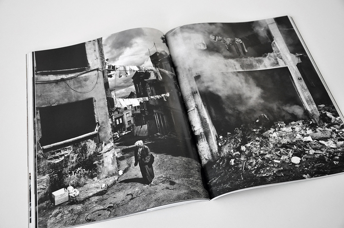
We embraced the idea that form follows function. In other words, we tried to design a layout that reflects the content of the story and even tells it before it is read.
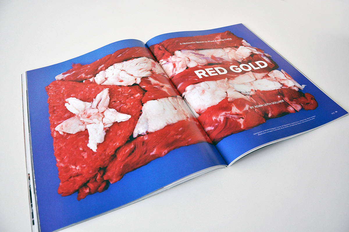
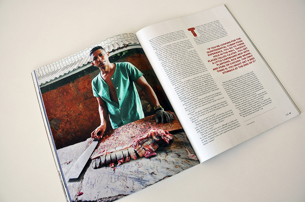
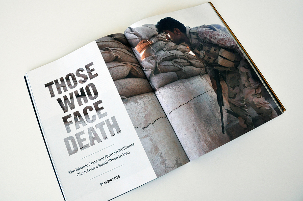
For example, the article about the scarcity of meat in Cuba is introduced by a “loud” moment (the Cuban flag made from meat) that works like a teaser, announcing the story about a place where meat is still considered as precious as gold.
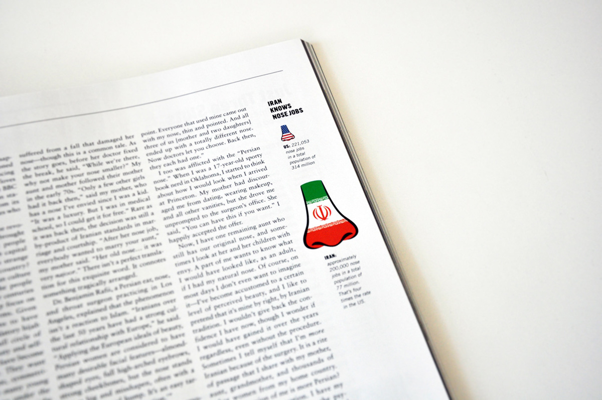
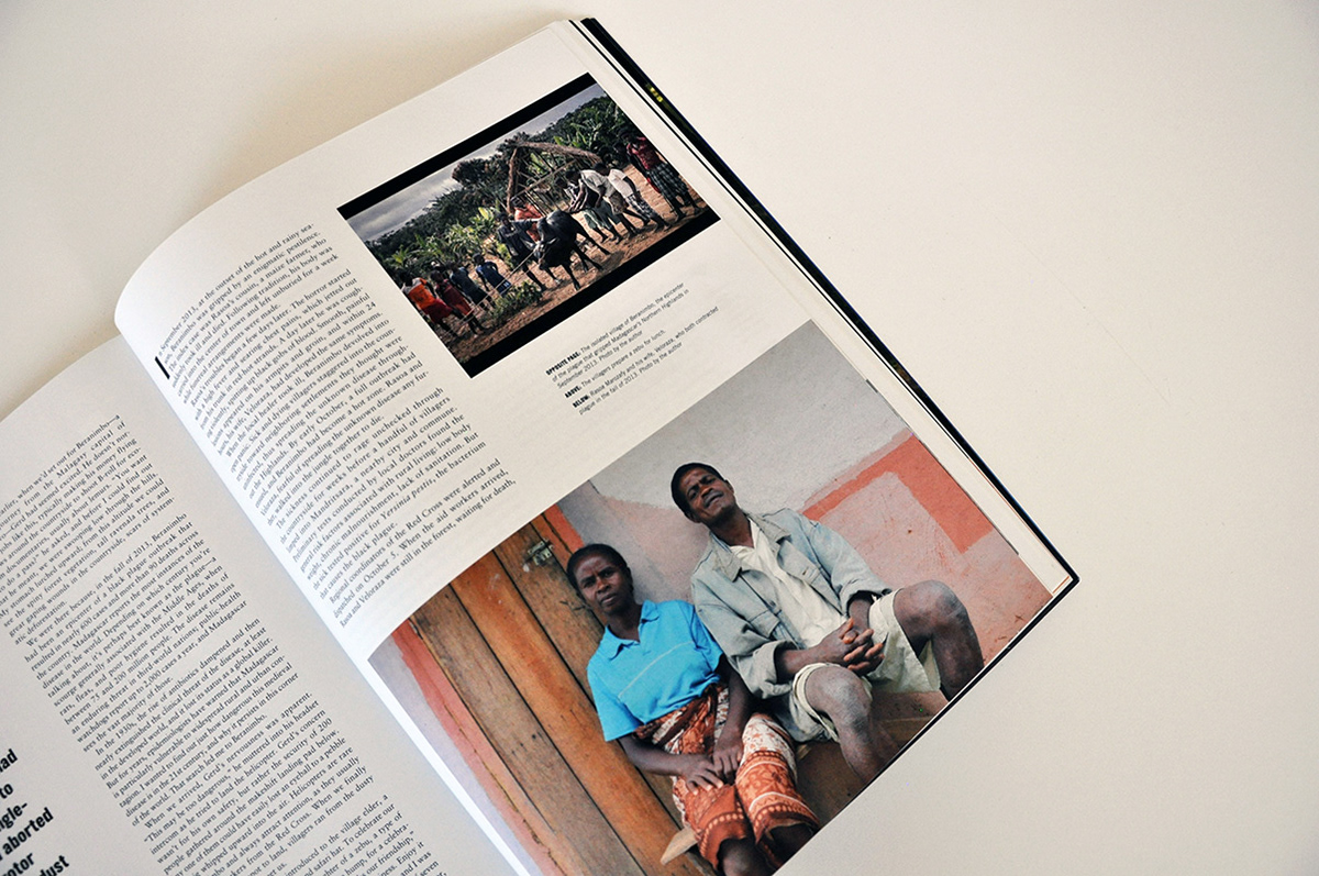
According to neuroscience, we use different parts of our brain when reading from a piece of paper as opposed to a screen. Millennials, the magazine's core audience, are a screen-focused generation of readers. To accommodate their reading habits within our overall concept, we offered small graphic tidbits (ubiquitous in a UI environment) to communicate information and to increase their appetite for longer stories.
An example of such eye candy is the nose infographic in the story about Iran’s booming cosmetic surgery industry.
Credits: Inkubator